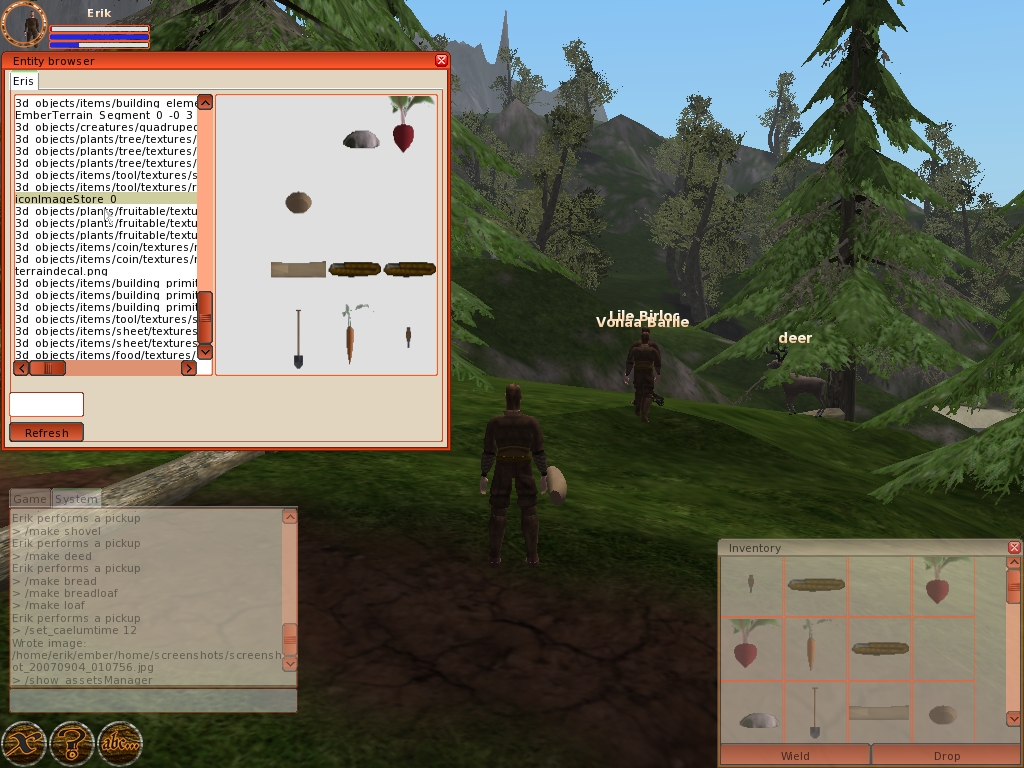
I've continued on the icon framework and started redesigning the inventory widget. I now have a working solution where the icon management framework provides automatically rendered icons to the widget. A work in progress screen shot can be seen to the left. This shows the icons in the inventory widget to the right, as well as the asset manager to the left, showing the icon texture.
Icons for entities will probably be used all over the interface. Apart from showing basic inventory I can see them being used in equipment dolls, quick bars, trading dialogues and so on.
Therefore I need to design a more robust generic system for dragging and dropping entity icons. Thankfully CEGUI already has excellent support for draggable windows. The icons in the inventory widget can already be dragged. What's left to do however is to allow for them to also be dropped. Preferably in a way that can easily be defined or extended in a lua script. The idea is to allow for entity icons to be dragged and dropped in a generic fashion, so that you should be able to drag and drop an icon from your quickbar to a trade dialogue in the very same way that you would be able to drag and drop it from your inventory.
In addition, I quickly realized that some entities are rendered nicely by default. For example, the coins are by default rendered lying down. Since they don't have any depth, this will result in an empty icon. We therefore need some way of defining how certain models should be rendered when shown as icons. This was easily fixed by extending the .modeldef format with a new "
The inventory also needs some better looking graphics. Well, the whole of the gui needs better looking graphics. I've created a blueprint for that here.
No comments:
Post a Comment